
Our Logos
by Joe Hornback
by Joe Hornback
| The very first SWBA logo was created with some kind of desktop publishing software like PrintMaster in the fall of 1987. I chose the State of Arizona and a cactus for the Southwest flavor. It was printed with the first printer I bought in 1984, an Epson dot matrix. |
|
|
At some point, during the course of the next two years, a buddy and I went together to buy the new technology called an InkJet printer by HP. It printed in black ink only and cost $200 at the time. I was able to clean up the logo a bit for a cleaner, smoother look. |
| Then, in 1990, a graphic designer named Dennis Michurski joined our league and not long after that, he upgraded our logo immensely. I think it started out black and white and I colored it in at some point. I was so excited to have such an awesome logo for our young league. |
|
|
Somewhere around 2006, Dennis thought we needed an upgrade in the font and color scheme to follow the current trends in sports. The result, another awesome addition to the rich SWBA history. |
| In 2013, Dennis created our 25+ logo to signify the longevity and future of the SWBA. Another masterpiece. I am looking forward to the next version. The logos just keep getting better. |
|
|
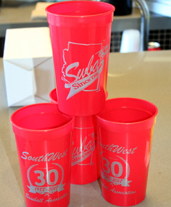
In 2017 for our 30th Anniversary season, I had some commemorative cups made for everyone in the league. These were handed out at the draft and mailed to the owners who couldn’t attend personally. |
| Inpired by the way the cups came out a new logo was born for our 30th Anniversary season. |
|
|
Over the years, I’ve extracted the swatches from Dennis’ creations and used them in stand alone fashion as well. Dennis and his friend Greg Guler have also created team logos for his team, the Minnesota Mudhens; my Arizona Arrows, his brother’s Twin City Centurions and the Hannibal Cannibals‘ logo. Those creations can be seen on their respective team’s pages. I hope you’ve enjoyed this trip down memory lane. |


